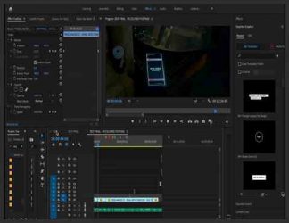
چگونگی install lut در adobe premiere
سپتامبر 17, 2019
3661
بدون دیدگاه


You must need to login..!
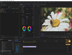
استفاده از نمودار زندگی شما را بسیار آسان تر می کند!
3 نمودار وجود دارد که باید از آنها استفاده کنید: نمودار موج ، نمودار هیستوگرام و نمودار. من به شما توصیه می کنم کاملاً یاد بگیرید که هرکدام چه کاری انجام می دهد ، زیرا من فقط آنچه را که باید جستجو کنم را پوشش می دهم تا تعادل رنگ سریع از آنها حاصل شود.
بزرگترین مزیت درک نمودارها این است که اگر توانایی مالی ندارید یا مانیتور متناسب با طیف رنگی ندارید ، می توانید بصورت بصری از اطلاعاتی که نمودارها به شما می دهند کار کنید و هنوز هم به طور م colorثر رنگ صحیح را دارید ، درجه بندی رنگ ممکن است دشوارتر باشد زیرا ترجیح شخصی تر از داده های خام است.
3 منطقه اصلی که در هر عکس مشاهده خواهید کرد Shadows / Midtones / Highlights است. هر برنامه این لیست تغییرات لومینسانس را کمی متفاوت می خواند ، همچنین ممکن است Blacks / Mids / White ها یا Lift / Gamma / Gain را ببینید. آنها تقریباً همه یکسان هستند و حتی ممکن است برخی از برنامه ها این امکان را به شما بدهند که از بین هر یک از آنها پرش کنید.
بهترین راه برای اینکه بفهمید هرکدام با شات شما چه کاری انجام می دهند و چه نوع تصحیحی انجام می شود ، آزمایش است. من به طور کلی آن را آزمایش می کنم با قرار دادن هر تنظیم در حد شدید و سپس بازگشت. اکنون که من یک معیار دارم ، می توانم آنچه را که نیاز دارم تنظیم کنم.
با استفاده از نمودارها ، چند نکته ساده برای شروع تعادل تصویر در حالت خنثی تر وجود دارد. در نمودارهای Waveform و Histogram خواهید دید که تمام اطلاعات بین 0 تا 100 IRE است. از ابزار Shadows / Blacks and the Highlights / White استفاده کنید تا بین 0 تا 100 نقطه مطابقت داشته باشد.
بنابراین ، سایه ها فقط باید فقط بالای 0 IRE قرار بگیرند و Highlight ها باید رها شوند تا کمی کمتر از 100 IRE باشند. با این کار اطمینان حاصل می کنید که هیچ چیزی خارج از محدوده پخش برای تصویر شما کاهش نمی یابد.
آهنگ های میانه کمی پیچیده تر هستند ، ما بعداً این موارد را کمی بررسی خواهیم کرد ، اما یک قانون اساسی این است که تن های میانی باید بین 60-70 IRE باشند. هرچند نگران نباشید ، تغییر حالت های میانی بسیار کم است و تاثیری در موقعیت Shadows و Highlights ندارد.
Using graphs will make your life so much easier!
There are 3 graphs that you need to utilize: Waveform, Histogram, and Vector graphs. I recommend you fully learn what each one does, as I’ll only be covering what to look for to achieve a quick color balance from them.
The biggest advantage of understanding the graphs is that if you can’t afford or don’t have a monitor that hits the right colour spectrums then you can intuitively work from the information the graphs are giving you and still effectively colour correct, colour grading may be more difficult as that is more personal preference that raw data.
The 3 main areas that you’ll be looking at in any shot are the Shadows/Midtones/Highlights. Each program calls this list of luminescence variations slightly differently, you may also see Blacks/Mids/Whites or Lift/Gamma/Gain. They are virtually all the same, and some programs may even give you the option to jump between various of each one.
The best way to find out what each one does to your shot and what type correction is being given is by experimenting. I generally test it by putting each setting to the extreme and then back. Now that I have a benchmark I can adjust to what I need.
Using the graphs, there are a few easy tips to get you started in balancing your image to a more neutral state. In the Waveform and Histogram graphs, you’ll see that all the information lies between 0 and 100 IRE. Use the tools for the Shadows/Blacks and the Highlights/Whites to bring in line between the 0 and 100 spots.
So, Shadows should only really hover just above 0 IRE and Highlights should be dropped so that they are just under 100 IRE. This will ensure that nothing is dropping outside of the broadcast range for your image.
Midtones are a little trickier, we’ll explore these a little bit later, but a basic rule of thumb is that mid tones should reside between 60–70 IRE. Don’t worry though, changing the mid tones has very little, to no effect on the position of the Shadows and Highlights.
ادیت و تدوین ویدیو برای ساخت یک فیلم کوتاه تخیلی و دلهره آور برای دانلود رایگان ادیت و تدوین ویدیو برای ساخت یک فیلم کوتاه تخیلی و دلهره آور با ک
آموزش ادیت و تدوین فیلم کوتاه برای دانلود رایگان آموزش ادیت و تدوین فیلم کوتاه با کیفیت 1080p از پلیر سایت یا لینک زیر استفاده کنین لینک دانلود link
آموزش ادیت فیلم کوتاه برای دانلود رایگان آموزش ادیت فیلم کوتاه با کیفیت 1080p از پلیر سایت یا لینک زیر استفاده کنین لینک دانلود link download مدت پخش
نکاتی در مورد ادیت و کات ویدیو در فیلمسازی برای دانلود رایگان نکاتی در مورد ادیت و کات ویدیو در فیلمسازی با کیفیت 1080p از پلیر سایت یا لینک زیر اس
آموزش ایجاد افکت نوارهای VHS رو ویدیو در Premiere برای دانلود آموزش ایجاد افکت نوارهای VHS رو ویدیو در Premiere با کیفیت full hd 1080p از پلیر سایت یا لینک زیر
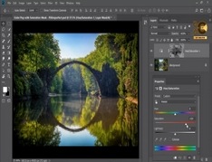
طریقه کار کردن با Mask و Saturation در photoshop(فتوشاپ) برای دانلود آموزش طریقه کار کردن با Mask و Saturation در photoshop(فتوشاپ) با کیفیت full hd 1080p از لینک زیر یا پلیر س