آموزش color grading سینمایی
سپتامبر 17, 2019
3741
بدون دیدگاه


You must need to login..!
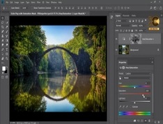
سبک سازی رنگ
سرانجام ، به درجه بندی رنگ می رسیم!
همانطور که خواندید ، درجه بندی یک انتخاب سبک است. این انتخابی است که شما به عنوان رنگ آمیز ، کارگردان انتخاب می کنید تا بتوانید لحن خاصی را برای ویدیوی خود تنظیم کنید. برخی از مثالهایی که ذکر کردیم The Matrix و The Aviator هستند. بیشتر فیلم های علمی-تخیلی و فانتزی درجه رنگ خاصی دارند به طوری که احساس یا دوره خاصی را برجسته می کنند.
اما درجه های رنگی نیز وجود دارد که نه تنها ژانری را نشان می دهد بلکه روند را نیز نشان می دهد. به عنوان مثال ، محبوب ترین درجه رنگ در هالیوود در حال حاضر درجه Teal-Orange. در اینجا شما سایه ها را به سمت قسمت Teal از طیف ، و تن های میانی به نارنجی ها ، و هایلایت ها را کمی به زردها می رانید. اکنون که آن را می دانید ، همه جا آن را مشاهده خواهید کرد. بارزترین آنها هر فیلم مایکل بی ، به خصوص حق رای دادن Transformers است. سیاه پوستان در آن فیلم ها عملاً آبی هستند.
چند ترفند دیگر برای سبک کردن شات با استفاده از وزنه برداری و ماسک است. به طور کلی ، شما می توانید از این موارد برای برجسته کردن مناطق خاص استفاده کنید. اطراف چشم را روشن کنید تا نگاه مخاطب را به آنجا متمرکز کنید ، یا با حفظ زمین قابل مشاهده ، آسمان را تاریک کنید. یا آنچه که اغلب در تبلیغات مشاهده خواهید کرد این است که ماسکی بر روی محصول لایه لایه شده است تا رنگ مارک را حفظ کند در حالی که بقیه عکس به روش خاصی تلطیف می شود.
این اغلب منجر به پاداش محصول می شود که در شات ظاهر می شود. به هر تبلیغ کوکاکولا فکر کنید و متوجه خواهید شد که آنها چه کاری انجام داده اند.
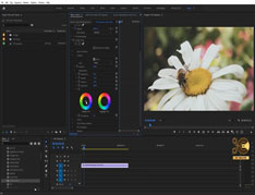
این یک کار نسبتاً کوتاه در مورد نحوه انجام اصلاح رنگ آسان است که اگر شروع به ساخت ویدیو ، آنلاین یا آفلاین می کنید. درجه بندی کمی ذهنی تر است. من توصیه می کنم کمی تئوری رنگ را جستجو کنید و ببینید چه احساسی با چه رنگی متناسب است. این یک نقطه شروع عالی است. Color CC از Adobe همچنین به شما راهی می دهد که ببینید رنگ ها مکمل کدام یک هستند. سپس می توانید از یک معیار برای تعیین سبک منحصر به فرد خود استفاده کنید.
Colour stylization
Finally, we get to color grading!
As you’ve read, grading is a style choice. It’s a choice that you as the colourist, director make so that you can set a specific tone to your video. Some of the examples we’ve mentioned are The Matrix and The Aviator. Most science-fiction and fantasy films tend to have a specific color grade so that they accentuate a certain feel or era.
But there are also color grades that not only denote a genre but also a trend. For example, the most popular color grade in Hollywood at the moment the Teal-Orange grade. Here you’re pushing the shadows towards the Teal part of the spectrum, and the mid tones to the oranges, and the highlights slightly to the yellows. Now that you know it, you’ll start seeing it everywhere. The most obvious one is any Michael Bay movie, especially the Transformers franchise. The blacks in those movies are practically blue.
A few other tricks to stylize a shot is by using vignettes and masks. Generally, you would use these to accentuate certain areas. Lighten the area around the eyes to focus the audience’s gaze upon there, or darkening a sky while maintaining a visible ground. Or what you will often see in advertisements is where a mask has been layered over the product so that it maintains the brand’s colors while the rest of the shot is stylized a certain way.
This will often lead to the bonus of the product popping in the shot. Think of any Coca-Cola ad and you’ll notice what they’ve done.
This was a fairly short run down of how to do some easy color correcting if you’re starting out with making video’s, online or offline. Grading is a little more subjective. I’d recommend looking up some color theory and seeing what emotion fits with what color. That’s a great starting point. Color CC from Adobe also gives you a way seeing what colors are complementary. Which you can then use a benchmark to determine your own unique style.
ادیت و تدوین ویدیو برای ساخت یک فیلم کوتاه تخیلی و دلهره آور برای دانلود رایگان ادیت و تدوین ویدیو برای ساخت یک فیلم کوتاه تخیلی و دلهره آور با ک
آموزش ادیت و تدوین فیلم کوتاه برای دانلود رایگان آموزش ادیت و تدوین فیلم کوتاه با کیفیت 1080p از پلیر سایت یا لینک زیر استفاده کنین لینک دانلود link
آموزش ادیت فیلم کوتاه برای دانلود رایگان آموزش ادیت فیلم کوتاه با کیفیت 1080p از پلیر سایت یا لینک زیر استفاده کنین لینک دانلود link download مدت پخش
نکاتی در مورد ادیت و کات ویدیو در فیلمسازی برای دانلود رایگان نکاتی در مورد ادیت و کات ویدیو در فیلمسازی با کیفیت 1080p از پلیر سایت یا لینک زیر اس
آموزش ایجاد افکت نوارهای VHS رو ویدیو در Premiere برای دانلود آموزش ایجاد افکت نوارهای VHS رو ویدیو در Premiere با کیفیت full hd 1080p از پلیر سایت یا لینک زیر
طریقه کار کردن با Mask و Saturation در photoshop(فتوشاپ) برای دانلود آموزش طریقه کار کردن با Mask و Saturation در photoshop(فتوشاپ) با کیفیت full hd 1080p از لینک زیر یا پلیر س